Tuesday, 30 March 2010
Friday, 19 March 2010
Visibility Graph
Visibility graph is one requirement in a Sight Stopping Distance (SSD) departure from standards submission to the Highways Agency.
This can be prepared using the new Sight Distance along Corridor tool included in the Civil 3D 2010 Subscription Advantage Pack (SAP) and MS Excel.
The Civil 3D part is pretty simple and quick to do with most work done in Excel.
For my sample data, I have a surface model of a motorway central reserve with concrete step barrier which was created using 3D polylines.
The SAP tools live in the Toolbox tab of the Toolspace.
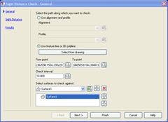
As in a number of Civil 3D commands, the tool will go through a wizard-type steps to get the desired output. The first box will ask to select a path for the visibility check. This can be in a form of an alignment and profile or feature lines or 3D polylines. This is also where we specify the start and end of the analysis. If an alignment is used for the path, it will ask for a chainage value and if a feature line or 3D polyine is used, points are used. Finally, choose the surface model to use.
The 2nd step is where we input the sight distance parameters such as the minimum SSD, driver’s eye height and offset and target object’s height and offset.
The offset being the offset distance from the path chosen in the first step. For my example my path is the road lane marking between Lane 2 and Lane 3 of the carriageway and I’d like the check to run along the centre of Lane 3.
Use negative (-) offset values if it is to the left side of the path and positive if on the right.
The next step of the wizard is to set whether the analysis components are to be drawn or not and which layers are to be used for each. Lastly, choose whether to create a report for the analysis. Use the CSV style report and chose where to save the report. The report will be saved as a .txt file.
That’s the Civil 3D part done and from here, it’s all MS Excel.
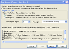
Open MS Excel and open the text file. Choose a Delimited data and comma as the delimiter.
Delete the information header and columns D and E.
Remove the unit “m” from the values by using Replace under the Edit menu. I added a new column where I placed the One Step below Desirable Minimum (relaxed) value of 215 which I also want to show on the graph. These parameters by the way are all in TD 9/93 of the DMRB.
So basically, the first column contains the chainages, 2nd column has the actual sight distance achieved from the analysis, the 3rd column is the desirable minimum sight distance and the 4th column is the relaxed value.
Insert menu> Chart and use a line-type chart and click Next.
On the 2nd step of the wizard, click the Series tab and click Add.
Give the Series a name. In my example I used “Visibility”. For the Values field, click the Value button and select the column B data (select and drag from Row 1 down to the row of the last value). For Category (X) axis labels, select the Column A data.
Click Add to create another Series and name it 295. For the Values field, click the Value button and select the Column C data.
Click Add to create another series and name it 215. For the Values field, click the Value button and select the Column D data.
Click Next and under the Titles tab, put Visibility for Chart title, Chainage for Category (X) axis and SSD in the Value (Y) axis.
Last step is to choose if the chart will be placed in a new sheet or as an object in the current worksheet and click Finish.
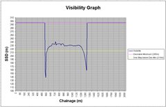
The graph will look similar to the image below. For better presentation, you can always go back and change the format/style of the different parts of the graph by selecting them and right click.
Here’s how a final output may look like.
Have a good weekend everyone!


